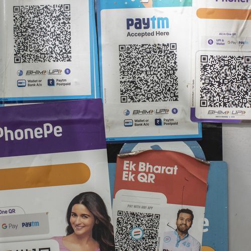
India’s fintech scene has hit a milestone that’s both a triumph and a trap. UPI just clocked over 10 billion transactions in a month, with banks, wallets, and startups all riding the same seamless rails. Everyone’s connected, success rates are neck-and-neck, and cashback offers get copied overnight. The raw functionality? It’s commoditized. In this crowded arena, the real edge isn’t piling on more bells and whistles—it’s crafting an experience that users actually crave. Forward-thinking fintechs are betting big on UI/UX not as a wrapper, but as the core engine shaping behavior, loyalty, and brand love. Think about it: users rarely celebrate a new feature. They live the journey. A transfer that zips through in 1.5 seconds versus 2? That’s invisible. But an app that feels intuitive, almost effortless? That’s magnetic. It’s the gap between tolerating your banking app and reaching for it first thing in the morning. Sounds intangible, right? Hardly. It’s the line between building a daily ritual and watching users bolt for the next promo. Look at food delivery giants like Zomato and Swiggy. For ages, they offered mirror-image services—same eateries, same ETAs. Loyalty didn’t hinge on one more filter or discount code. It came down to the sheer joy (or lack thereof) in placing that order. Fintech’s staring down the same reality. As features parity kicks in, UI/UX steps up as the silent powerhouse driving retention. In money matters, hesitation is poison. A thoughtfully designed interface cuts through doubt like a hot knife. Picture this: you earn a reward, and it pops up right there, crystal clear—no digging through menus. Redemption? One tap, done. Suddenly, the app doesn’t just work; it feels reliable, like it’s got your back. Every snag—a clunky form, a confusing nav bar—plants a seed of suspicion that festers into abandonment. Globally, over $16 billion in loyalty points sit unused each year. Lazy features? Sure. But mostly, it’s poor design turning potential delight into drudgery. In India, where UPI’s magic lies in its frictionless core, fintechs ignoring UX are leaving money on the table—literally. The magic happens when great design turns one-off actions into unbreakable loops. Users return because it feels good. Frequent use stacks up rewards effortlessly. Smooth redemptions seal the deal, turning casual swipers into superfans. Competitors can mimic your UPI integration or match your 5% cashback, but they can’t clone the emotional pull of an app that just gets you. This isn’t fluff—it’s behavioral science in action. Consistent, human-centered UI/UX wires the brain for repetition. I’ve seen it firsthand in apps like PhonePe or Google Pay: the ones that load fast, guide intuitively, and celebrate small wins keep users locked in, even when rivals dangle bigger carrots. Fintech leaders are waking up to this shift. Design teams aren’t siloed anymore; they’re at the strategy table from day one. Take CRED: its sleek, gamified vibe isn’t window dressing